
Overview
The jQuery dropdownReplacement plugin allows you to and unobtrusively upgrade inputs and native selects into a dropdown widget that is indistinguishable from a native select box in both look and functionality.A quick demo: or something more dramatic: (See examples for much more)
There are several advantages to using a javascript widget over the native select box:
- Skinnable
- Less restrictive
- Save bandwidth
- Interesting things can be done!
Quick Start Guide
Converting an existing select
Find an existing select box to convert: Include the scripts and styles required by the dropdownReplacement plugin and a short script to initialize the dropdown when the DOM is ready: This will yeild a widgetized select: <- Yes that is a javascript widget you are looking at.Widgetizing an input
Its not always optimal to build a widget from an existing select, for that reason you have an option to widgetize an input box by providing a list of options to use in JSON format.You start out with an input that can contain the default text selection of the to-be dropdown: Include the scripts and styles required by the dropdownReplacement plugin and a short script to initialize the dropdown when the DOM is ready: This will yeild a widgetized select:
Those are the basics! For more complex demos see the examples tab or take a look at the API.
Options
| Option Key | Default Value | Description |
|---|---|---|
| options | null [required] | As of 0.5.2 options can be a function that returns a JSON list or jQuery object. In this function 'this' is the select being widgetized options can be a JSON list ex: [{"v":"val1", "t":"test"},{"v":"v2", "t":"text2"}], prebuilt options html (see demos), or null if 'this' is a select |
| selectClass | null | user defined class to give to the element that will act as the SELECT |
| optionsClass | "dropdownOpts" | the options body class - for skinning purposes |
| optionsDisplayNum | 25 | number of options to display before making a scrollbar |
| optionClass | "dropdownOpt" | every OPTION will have this class |
| optionSelectedClass | "selectedOpt" | class to give to the selected option |
| resizeSelectToFitOptions | false | if false - the options will extend beyond the select box. this may be preferable |
| useHiddenInput | true | when selected value is changed copy it to a hidden input with same name as the original element. otherwise use onSelect function to do it yourself |
| resizeOptionsToFitSelect | true | set this to false, and if your options are 20px, and select 200px, the options will stay 20px |
| selectCssWidth | null | set width of the dropdown, pass in entire css string ex: '400px !important' |
| optionsWidthOffset | 3 | magic number that you can fiddle with if the width of the options body is wrong |
| debounceLookupMs | 200 | when user types in order to find the option, this is the timeout between keystrokes before doing the search |
| debounceArrowsMs | 50 | timeout between arrow keydowns before firing onSelect |
| lookupMaxWordLength | 3 | higher the number, more you can look up by typing at the select, more memory used/slower load time. |
| ellipsisSelectText | true | if select is resized smaller then dropdown text, will we add a "..." to end of it to indicate overflow. NOTE: if true, all options below are enabled: |
| ellipsisText | '...' | can set custom ellipsis using this |
| charWidth | null | set to null to calculate width automatically (this may not work if your input has styles other than the ones that come with this widget). value in pixels. |
| onInit | function($select, $input){} | this is run on init of the widget. $select is the widget, $input is the hidden input (may be null if 'useHiddenInput' = false) |
| onSelect | function(value, text, selectIndex){} | fired when user selects something. args: this = $select, value = value of selection, text = text of selection, selectIndex = index of dropdown |
Code Samples
Existing select box
Starting with the following select box:
The simplest way to upgrade this to a dropdown widget is:
Note how the dropdown extends over the width of the select box. This is usually desired. If you select text that does not fit into the select box, it gets an ellipsis added to it automatically.
You can use up and down arrows to navigate the select box, also you can type letters in order to jump to that letter.
You can use up and down arrows to navigate the select box, also you can type letters in order to jump to that letter.
Control the number of items shown:
Dropdown is resized to fit the options:
Dropdown is resized to 100px, and a change function is wired:
Widgetizing an input
You have more control when you widgetize an input, or a set of inputs.
Five inputs are widgetized to use the same dropdown body. This is very useful in reports where you have to make identical selections for sets of items. This saves bandwidth as well.
The last param in the change function gives you the index of the triggering input.
The last param in the change function gives you the index of the triggering input.
A single input is widgetized, but two dropdown widgets are wired into it. This means that both dropdowns feed into one form input. This is useful when you want to show two different inputs, usually one at a time, but simplify the server side by using a single form name.
Change dropdown:
Using pre-built options
Instead of letting the widget built the options body for you via an existing select or a JSON object, sometimes it may be desirable to build the object yourself. For example you might want to build a large options body on the server side - saving client side init time.
Another advantage to using a prebuilt options body is the ability to skin it. You can easily experiment with what can go inside the options body.
Another advantage to using a prebuilt options body is the ability to skin it. You can easily experiment with what can go inside the options body.
To use an prebuilt options body, pass a jquery reference to it as the options param.
Note: in order to avoid browser positioning weirdnesses, I recommend that you place the dropdown options div at the bottom of your DOM, ideally as a direct child of the BODY tag
You can emulate <optgroup> support using prebuilt options. use 'optgroup' class on your options div and the following markup:
You can also add images or whatever you want (within reason) to the dropdown body.
As of 0.5.2, the options can be a function that returns either json or a jquery. The this in the function is the dropdown being widgetized.
Using Advanced Options
Resize options to fit (a large) select:
There is another option resizeOptionsToFitSelect which defaults to true. Usually you want to resize the options, but not the select.
A dictionary tree of the dropdown options is built to do quick selections when user types a letter or letters. By default the dictionary is 3 letters deep, meaning that only the first 3 letters of each option are added to the dictionary.
The option lookupMaxWordLength sets the number of letters to remember. Increasing this number will lead to slower widget init time. The question of "how much slower?" is up to you to answer.
The option lookupMaxWordLength sets the number of letters to remember. Increasing this number will lead to slower widget init time. The question of "how much slower?" is up to you to answer.
Go ahead and type some weird European street names into the dropdown and watch it seek to them. Press 'b' a few times in a row and see what happens.
In order to make the dropdown widget less of a CPU hog, keyboard events are debounced, this can make the widget seem less responsive. You can use the options
debounceLookupMs and debounceArrowsMs to change the debounce intervals.
The default values are debounceLookupMs=200 and debounceArrowsMs=50. This dropdown should seem more responsive than the others (unless it hogs your CPU).
There are 3 options which control the ellipsis functionality. If ellipsisSelectText
ellipsisText by default is set to "..." but can be anything.
Normally charWidth is null, which means that determining where to chop of the text is done using magic. If the magic fails, you can set the character width that is used in the calculation here. Double values work fine.
ellipsisText by default is set to "..." but can be anything.
Normally charWidth is null, which means that determining where to chop of the text is done using magic. If the magic fails, you can set the character width that is used in the calculation here. Double values work fine.
Not surprisingly, the text is chopped off much sooner then it needs to be now.
Data Access
Data access is simple. You can grab the currently selected text or value from a widget by using the "option" argument.
The buttons call the data access functions above.
Sometimes you may need to have direct access to the underlying DOM elements that make up the dropdown. Specifically the hidden input. The widget uses a hidden input to store the dropdown 'value'. The text is stored in the visible input.
You can access the visible and the hidden inputs in two ways.
Using the 'option' object:
Sometimes you may need to find the visible input of a widget, who's hidden input contains some property. This is done via a custom selector.
The selector takes one argument which is a jquery selector, and runs its against both the visible input and the hidden input, if there is a match in either input, the selector matches:
Download
A current stable version is 0.5.3Development version: jquery.dropdownReplacement-0.5.3.js
Production version: jquery.dropdownReplacement-0.5.3-pack.js
css: jquery.dropdownReplacement.css
An older stable version is 0.5
Download a zip containing the v0.5 plugin and this guide here
Dependencies of this plugin (which are included in the download above) are:
- jquery 1.4.2+ [required]
- jquery.scrollTo-1.4.2.js [required]
- query.support.windowsTheme-0.3.js [optional]
- jquery.bgiframe.js 1.2.1+ [optional]
CDN Hosted
Hosted version is 0.5Cachedcommons.org was kind enough to provide a CDN hosted version of this plugin for you to use.
Change log
0.5.3 (5/8/11):- Fixed an issue with using arrow keys when the dropdown body is custom html (may contain elements other than <a>)
- Tested jQuery 1.6 compatability
0.5.2 (2/22/11):
- Added ability to use different dropdown bodies in a single widget. (see api).
0.5.0 (07/07/10):
- Stabilization.
License:
	The MIT License

	Copyright (c) 2010-2011 Mikhail Koryak

	Permission is hereby granted, free of charge, to any person obtaining a copy
	of this software and associated documentation files (the "Software"), to deal
	in the Software without restriction, including without limitation the rights
	to use, copy, modify, merge, publish, distribute, sublicense, and/or sell
	copies of the Software, and to permit persons to whom the Software is
	furnished to do so, subject to the following conditions:

	The above copyright notice and this permission notice shall be included in
	all copies or substantial portions of the Software.

	THE SOFTWARE IS PROVIDED "AS IS", WITHOUT WARRANTY OF ANY KIND, EXPRESS OR
	IMPLIED, INCLUDING BUT NOT LIMITED TO THE WARRANTIES OF MERCHANTABILITY,
	FITNESS FOR A PARTICULAR PURPOSE AND NONINFRINGEMENT. IN NO EVENT SHALL THE
	AUTHORS OR COPYRIGHT HOLDERS BE LIABLE FOR ANY CLAIM, DAMAGES OR OTHER
	LIABILITY, WHETHER IN AN ACTION OF CONTRACT, TORT OR OTHERWISE, ARISING FROM,
	OUT OF OR IN CONNECTION WITH THE SOFTWARE OR THE USE OR OTHER DEALINGS IN
	THE SOFTWARE.
Also, site layout ideas and some javascript borrowed from malsup.com
Who is using dropdownReplacement?
Please email me if you are using this plugin in production and would like a link here.|
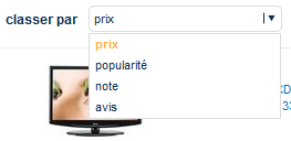
The nicest integration ive seen: vergelijk.nl, vergelijk.be, elcheapo.nl, vertaa.fi, comparer.fr and comparer.be |
|
|
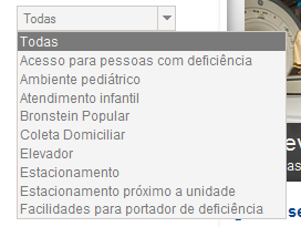
A classic look http://www.bronstein.com.br/ |
|
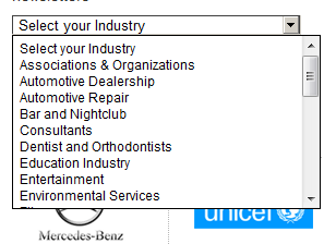
| http://www.benchmarkemail.com/ |
|
| http://www.webshare.co/sharing-the-web/sign-up/ | [no image] |
| http://www.tylenolliverdamagelawsuit.com/ | Jim Sokolove uses my plugin!! yey? |
| http://www.ezytred.com/Kids_Fashion/Short_Sleeves_Set | China uses my plugin!! yey? |
©2010 - 2011 Mikhail Koryak - http://notetodogself.blogspot.com